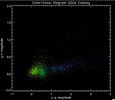
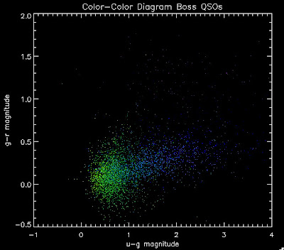
Here are the color-color diagrams with redshift temperature plots for the current QSO Catalog (in the BOSS redshift range) and the BOSS 3PC Quasars (same temperature-z map as before). I think this shows pretty well that something is wrong with the QSO Catalog's color distribution. These both have the same number of quasars, in the same redshift range:


Their redshift distributions are not that different so this is really a matter of the input QSOs not properly representing the spread of the possible colors, I believe:
I want to add in BOSS QSOs to Joe's Monte Carlo. We can do this by just adding in the "chunk 1" objects where we have co-added photometry from Stripe-82, or we can apply the same cuts in terms of brightness as we did to the DR5 catalog.


No comments:
Post a Comment