Tuesday, September 25, 2012
Funemployment
Hey everyone. I've submitted my PhD thesis, and decided to take a little break between school and starting my next phase of life. I will be traveling for the next few months and not posting here. If you want to keep up with my travel adventures, please check out my travel blog: travelerjess.blogspot.com


Monday, July 16, 2012
Making Awesome Latex Tables
Yep, still disserating... thus all the posts are more about the process of writing than actual science research. Here is a post about how to make awesome looking tables using latex and deluxetable.
I like using the deluxetable style in latex because the tables look nicer than normal latex tables, and you have more flexibility. Below is an example of a cool table with come nice features that I made for my thesis:


Latex Code:
\begin{deluxetable}{cccccccc}
\tabletypesize{\footnotesize}
\tablecolumns{8}
\tablewidth{0pt}
\tablecaption{ Cross-correlation Fit Details
\label{tab:lumresults1}}
\tablehead{
\colhead{QSO} \vspace{-0.2cm}& \colhead{$R$ Range} & & & & &\colhead{Separation} & \colhead{Result}\\ \vspace{-0.2cm}
& & \colhead{$\langle f \rangle$} & \colhead{$r_0$} & \colhead{$\gamma$}& $W$ & & \\
\colhead{Division} & \colhead{(Mpc/h)} & \colhead{} & \colhead{} & \colhead{}&& \colhead{(\%)} & \colhead{Strength}}
\startdata
\vspace{-0.2cm} \nicefrac{1}{3} Bright & & $4.24 \cdot 10^{-4}$ & 6.19 && 96.97 & &\\ \vspace{-0.2cm}
& [0.3,3] & & & 1.77 & & 96.7 & 1.9$\sigma$ \\
\nicefrac{2}{3} Dim & & $4.26 \cdot 10^{-4}$ & 4.48 & & 52.77
\enddata
\vspace{-0.8cm}
\tablecomments{Luminosity dependent quasar clustering using a cross-correlation technique between CS82 galaxies ($M < 23.5$) and SDSS, BOSS, and 2SLAQ quasars \hbox{($0.5$)}}
\end{deluxetable}
Note that you need the file deluxetable.sty from here.
Sunday, July 8, 2012
Fun with Python Axes
Sometimes you want to make a plot with two axes, and sometimes you also want the tickmarks on both those axes to look a certain way. Here's how you do it:


fig = plt.figure(figsize = (11,10))
ax = fig.add_subplot(111)
for i in range(size(magcuts)): ax.plot(xdata[i],ydata[i], label=label[i], linewidth = 2.0)
leg = ax.legend(loc=3,shadow=False,prop=FontProperties(size=25),fancybox = True)
leg.get_frame().set_alpha(0)
ax.set_xlabel("$\\chi \\mathrm{\\ (Mpc/h)}$",fontsize=30)
ax.set_ylabel("$f(\\chi)$",fontsize=30)
bx = twiny()
bx.plot(xdata2,ydata,alpha=0)
bx.set_xlabel("$\\mathrm{redshift\\ }(z)$",fontsize=30)
ticklabels = bx.get_xticklabels()
for label in ticklabels:
label.set_fontsize(18)
label.set_family('serif')
ticklabels = ax.get_xticklabels()
for label in ticklabels:
label.set_fontsize(18)
label.set_family('serif')
ticklabels = ax.get_yticklabels()
for label in ticklabels:
label.set_fontsize(18)
label.set_family('serif')
filename = "plot2save"
savefig(filename + '.eps',format = 'eps', transparent=True)
savefig(filename + '.pdf',format = 'pdf', transparent=True)
savefig(filename + '.png',format = 'png', transparent=True)
Tuesday, June 19, 2012
TeXShop and .ps or .eps Files
I am frantically writing my thesis right now, so most of my "research" has to do with struggling with LaTex at the moment.
I am using TeXShop on Mac OS X to LaTeX my thesis. I've encountered the problem that TeXShop doesn't seem to like .ps or .eps files. So it requires some finagling to get TeXShop to handle these files. Here are some tricks I've found:
1) Convert the .(e)ps files to PDF:
In a terminal window write the following command
ps2pdf filetoconvert.ps
eps2pdf filetoconvert.eps
This will produce the following file: filetoconvert.pdf
If you want to do a whole slew of files in a directory you can use the following script:
for x in *.ps; do
echo $x;
ps2pdf $x ${x/%ps/pdf};
done
2) Use Conversion Packages in TeXShop:
\usepackage{epstopdf}
I am using TeXShop on Mac OS X to LaTeX my thesis. I've encountered the problem that TeXShop doesn't seem to like .ps or .eps files. So it requires some finagling to get TeXShop to handle these files. Here are some tricks I've found:
1) Convert the .(e)ps files to PDF:
In a terminal window write the following command
ps2pdf filetoconvert.ps
eps2pdf filetoconvert.eps
This will produce the following file: filetoconvert.pdf
If you want to do a whole slew of files in a directory you can use the following script:
for x in *.ps; do
echo $x;
ps2pdf $x ${x/%ps/pdf};
done
2) Use Conversion Packages in TeXShop:
\usepackage{epstopdf}
\usepackage{ps2pdf}
\usepackage{pslatex}
Monday, April 2, 2012
Pretty Plots - 2D Histogram with 1D Histograms on Axes
Note: This post has been cross-posted to AstroBetter with a slightly more readable version of the code. You might want to check it out there.
In a long list of plots that Martin wants me to add to the paper draft I sent out last week, the following:
Is it possible to show the histograms projected along each axis in addition to the 2D density? I know people do this in IDL frequently, I'm not sure how to do this in matplotlib. If it's possible we could play a similar game with the L-z figure. The 1D histograms contain lots of useful information, including how significant our clustering detection is in each bin.
Ask and you shall receive Martin. Below is the "money plot" (the temperature 2D histogram which shows amplitudes the bright versus dim correlation function) with histograms on the side of either axis.

In a long list of plots that Martin wants me to add to the paper draft I sent out last week, the following:
Is it possible to show the histograms projected along each axis in addition to the 2D density? I know people do this in IDL frequently, I'm not sure how to do this in matplotlib. If it's possible we could play a similar game with the L-z figure. The 1D histograms contain lots of useful information, including how significant our clustering detection is in each bin.
Ask and you shall receive Martin. Below is the "money plot" (the temperature 2D histogram which shows amplitudes the bright versus dim correlation function) with histograms on the side of either axis.
I based this plot on code from here.
There are some cool features that I'll describe in the comments below. I think this plot rocks.
import numpy as np
import matplotlib.pyplot as plt
from matplotlib.ticker import NullFormatter
def makeTempHistogramPlot(xdata,ydata,rexp,filename=None,xlims=-99, ylims =-99 , \
nxbins = 50,nybins=50, bw=0, nbins=100,contours=1,sigma=1,line=1):
#bw = 0 for color, = 1 for black and white
#line = 0 for no line, =1 for line
#sigma = 1 for display % below line, =0 for not
#contours = 1 for display 1,2,3 sigma contours, = 0 for not.
# Define the x and y data
x = xdata
y = ydata
# Set up default x and y limits
if (xlims == -99): xlims = [0,max(x)]
if (ylims == -99): ylims = [0,max(y)]
# Set up your x and y labels
xlabel = '$\mathrm{Your\\ X\\ Label}$'
ylabel = '$\mathrm{Your\\ X\\ Label}$'
mtitle = ''
# Define the locations for the axes
left, width = 0.12, 0.55
bottom, height = 0.12, 0.55
bottom_h = left_h = left+width+0.02
# Set up the geometry of the three plots
rect_temperature = [left, bottom, width, height] # dimensions of temp plot
rect_histx = [left, bottom_h, width, 0.25] # dimensions of x-histogram
rect_histy = [left_h, bottom, 0.25, height] # dimensions of y-histogram
# Set up the size of the figure
fig = plt.figure(1, figsize=(9.5,9))
# Make the three plots
axTemperature = plt.axes(rect_temperature) # temperature plot
axHistx = plt.axes(rect_histx) # x histogram
axHisty = plt.axes(rect_histy) # y histogram
# Remove the inner axes numbers of the histograms
nullfmt = NullFormatter()
axHistx.xaxis.set_major_formatter(nullfmt)
axHisty.yaxis.set_major_formatter(nullfmt)
# Find the min/max of the data
xmin = min(xlims)
xmax = max(xlims)
ymin = min(ylims)
ymax = max(y)
# Make the 'main' temperature plot
xbins = linspace(start = 0, stop = xmax, num = nxbins)
ybins = linspace(start = 0, stop = ymax, num = nybins)
xcenter = (xbins[0:-1]+xbins[1:])/2.0
ycenter = (ybins[0:-1]+ybins[1:])/2.0
aspectratio = 1.0*(xmax - 0)/(1.0*ymax - 0)
H, xedges,yedges = N.histogram2d(y,x,bins=(ybins,xbins))
X = xcenter
Y = ycenter
Z = H
# Plot the temperature data
if(bw): cax = axTemperature.imshow(H, extent=[xmin,xmax,ymin,ymax], \
interpolation='nearest', origin='lower',aspect=aspectratio, cmap=cm.gist_yarg)
else : cax = axTemperature.imshow(H, extent=[xmin,xmax,ymin,ymax], \
interpolation='nearest', origin='lower',aspect=aspectratio)
# Plot the temperature plot contours
if(bw): contourcolor = 'black'
else: contourcolor = 'white'
if (contours==0):
print ''
elif (contours==1):
xcenter = N.mean(x)
ycenter = N.mean(y)
ra = N.std(x)
rb = N.std(y)
ang = 0
X,Y=ellipse(ra,rb,ang,xcenter,ycenter)
axTemperature.plot(X,Y,"k:",ms=1,linewidth=2.0)
axTemperature.annotate('$1\\sigma$', xy=(X[15], Y[15]), xycoords='data',xytext=(10, 10), textcoords='offset points',horizontalalignment='right', verticalalignment='bottom',fontsize=25)
X,Y=ellipse(2*ra,2*rb,ang,xcenter,ycenter)
axTemperature.plot(X,Y,"k:",color = contourcolor,ms=1,linewidth=2.0)
axTemperature.annotate('$2\\sigma$', xy=(X[15], Y[15]), xycoords='data',xytext=(10, 10), textcoords='offset points',horizontalalignment='right', verticalalignment='bottom',fontsize=25, color = contourcolor)
X,Y=ellipse(3*ra,3*rb,ang,xcenter,ycenter)
axTemperature.plot(X,Y,"k:",color = contourcolor, ms=1,linewidth=2.0)
axTemperature.annotate('$3\\sigma$', xy=(X[15], Y[15]), xycoords='data',xytext=(10, 10), textcoords='offset points',horizontalalignment='right', verticalalignment='bottom',fontsize=25, color = contourcolor)
else:
xcenter = N.mean(x)
ycenter = N.mean(y)
ra = N.std(x)
rb = N.std(y)
ang = contours*N.pi/180.0
X,Y=ellipse(ra,rb,ang,xcenter,ycenter)
axTemperature.plot(X,Y,"k:",ms=1,linewidth=2.0)
axTemperature.annotate('$1\\sigma$', xy=(X[15], Y[15]), xycoords='data', xytext=(10, 10), textcoords='offset points',horizontalalignment='right', verticalalignment='bottom',fontsize=25)
X,Y=ellipse(2*ra,2*rb,ang,xcenter,ycenter)
axTemperature.plot(X,Y,"k:",ms=1,linewidth=2.0, color = contourcolor)
axTemperature.annotate('$2\\sigma$', xy=(X[15], Y[15]), xycoords='data', xytext=(10, 10), textcoords='offset points',horizontalalignment='right', verticalalignment='bottom',fontsize=25, color = contourcolor)
X,Y=ellipse(3*ra,3*rb,ang,xcenter,ycenter)
axTemperature.plot(X,Y,"k:",ms=1,linewidth=2.0, color = contourcolor)
axTemperature.annotate('$3\\sigma$', xy=(X[15], Y[15]), xycoords='data', xytext=(10, 10), textcoords='offset points',horizontalalignment='right', verticalalignment='bottom',fontsize=25, color = contourcolor)
#Plot the % below line
belowline = 1.0*size(where((x - y) > 0.0))/size(x)*1.0*100
if(sigma): axTemperature.annotate('$%.2f\%%\mathrm{\\ Below\\ Line}$'%(belowline), xy=(xmax-100, ymin+3),fontsize=20, color = contourcolor)
#Plot the axes labels
axTemperature.set_xlabel(xlabel,fontsize=25)
axTemperature.set_ylabel(ylabel,fontsize=25)
#Make the tickmarks pretty
ticklabels = axTemperature.get_xticklabels()
for label in ticklabels:
label.set_fontsize(18)
label.set_family('serif')
ticklabels = axTemperature.get_yticklabels()
for label in ticklabels:
label.set_fontsize(18)
label.set_family('serif')
#Plot the line on the temperature plot
if(line): axTemperature.plot([-1000,1000], [-1000,1000], 'k-', linewidth=2.0, color = contourcolor)
#Set up the plot limits
axTemperature.set_xlim(xlims)
axTemperature.set_ylim(ylims)
#Set up the histogram bins
xbins = N.arange(xmin, xmax, (xmax-xmin)/nbins)
ybins = N.arange(ymin, ymax, (ymax-ymin)/nbins)
#Plot the histograms
if (bw):
axHistx.hist(x, bins=xbins, color = 'silver')
axHisty.hist(y, bins=ybins, orientation='horizontal', color = 'dimgray')
else:
axHistx.hist(x, bins=xbins, color = 'blue')
axHisty.hist(y, bins=ybins, orientation='horizontal', color = 'red')
#Set up the histogram limits
axHistx.set_xlim( 0, max(x) )
axHisty.set_ylim( 0, max(y))
#Make the tickmarks pretty
ticklabels = axHistx.get_yticklabels()
for label in ticklabels:
label.set_fontsize(12)
label.set_family('serif')
#Make the tickmarks pretty
ticklabels = axHisty.get_xticklabels()
for label in ticklabels:
label.set_fontsize(12)
label.set_family('serif')
#Cool trick that changes the number of tickmarks for the histogram axes
axHisty.xaxis.set_major_locator(MaxNLocator(4))
axHistx.yaxis.set_major_locator(MaxNLocator(4))
if(filename):
savefig(filename + '.eps',format = 'eps', transparent=True)
savefig(filename + '.pdf',format = 'pdf', transparent=True)
savefig(filename + '.png',format = 'png', transparent=True)
return 0
There are some cool features that I'll describe in the comments below. I think this plot rocks.
import numpy as np
import matplotlib.pyplot as plt
from matplotlib.ticker import NullFormatter
def makeTempHistogramPlot(xdata,ydata,rexp,filename=None,xlims=-99, ylims =-99 , \
nxbins = 50,nybins=50, bw=0, nbins=100,contours=1,sigma=1,line=1):
#bw = 0 for color, = 1 for black and white
#line = 0 for no line, =1 for line
#sigma = 1 for display % below line, =0 for not
#contours = 1 for display 1,2,3 sigma contours, = 0 for not.
# Define the x and y data
x = xdata
y = ydata
# Set up default x and y limits
if (xlims == -99): xlims = [0,max(x)]
if (ylims == -99): ylims = [0,max(y)]
# Set up your x and y labels
xlabel = '$\mathrm{Your\\ X\\ Label}$'
ylabel = '$\mathrm{Your\\ X\\ Label}$'
mtitle = ''
# Define the locations for the axes
left, width = 0.12, 0.55
bottom, height = 0.12, 0.55
bottom_h = left_h = left+width+0.02
# Set up the geometry of the three plots
rect_temperature = [left, bottom, width, height] # dimensions of temp plot
rect_histx = [left, bottom_h, width, 0.25] # dimensions of x-histogram
rect_histy = [left_h, bottom, 0.25, height] # dimensions of y-histogram
# Set up the size of the figure
fig = plt.figure(1, figsize=(9.5,9))
# Make the three plots
axTemperature = plt.axes(rect_temperature) # temperature plot
axHistx = plt.axes(rect_histx) # x histogram
axHisty = plt.axes(rect_histy) # y histogram
# Remove the inner axes numbers of the histograms
nullfmt = NullFormatter()
axHistx.xaxis.set_major_formatter(nullfmt)
axHisty.yaxis.set_major_formatter(nullfmt)
# Find the min/max of the data
xmin = min(xlims)
xmax = max(xlims)
ymin = min(ylims)
ymax = max(y)
# Make the 'main' temperature plot
xbins = linspace(start = 0, stop = xmax, num = nxbins)
ybins = linspace(start = 0, stop = ymax, num = nybins)
xcenter = (xbins[0:-1]+xbins[1:])/2.0
ycenter = (ybins[0:-1]+ybins[1:])/2.0
aspectratio = 1.0*(xmax - 0)/(1.0*ymax - 0)
H, xedges,yedges = N.histogram2d(y,x,bins=(ybins,xbins))
X = xcenter
Y = ycenter
Z = H
# Plot the temperature data
if(bw): cax = axTemperature.imshow(H, extent=[xmin,xmax,ymin,ymax], \
interpolation='nearest', origin='lower',aspect=aspectratio, cmap=cm.gist_yarg)
else : cax = axTemperature.imshow(H, extent=[xmin,xmax,ymin,ymax], \
interpolation='nearest', origin='lower',aspect=aspectratio)
# Plot the temperature plot contours
if(bw): contourcolor = 'black'
else: contourcolor = 'white'
if (contours==0):
print ''
elif (contours==1):
xcenter = N.mean(x)
ycenter = N.mean(y)
ra = N.std(x)
rb = N.std(y)
ang = 0
X,Y=ellipse(ra,rb,ang,xcenter,ycenter)
axTemperature.plot(X,Y,"k:",ms=1,linewidth=2.0)
axTemperature.annotate('$1\\sigma$', xy=(X[15], Y[15]), xycoords='data',xytext=(10, 10), textcoords='offset points',horizontalalignment='right', verticalalignment='bottom',fontsize=25)
X,Y=ellipse(2*ra,2*rb,ang,xcenter,ycenter)
axTemperature.plot(X,Y,"k:",color = contourcolor,ms=1,linewidth=2.0)
axTemperature.annotate('$2\\sigma$', xy=(X[15], Y[15]), xycoords='data',xytext=(10, 10), textcoords='offset points',horizontalalignment='right', verticalalignment='bottom',fontsize=25, color = contourcolor)
X,Y=ellipse(3*ra,3*rb,ang,xcenter,ycenter)
axTemperature.plot(X,Y,"k:",color = contourcolor, ms=1,linewidth=2.0)
axTemperature.annotate('$3\\sigma$', xy=(X[15], Y[15]), xycoords='data',xytext=(10, 10), textcoords='offset points',horizontalalignment='right', verticalalignment='bottom',fontsize=25, color = contourcolor)
else:
xcenter = N.mean(x)
ycenter = N.mean(y)
ra = N.std(x)
rb = N.std(y)
ang = contours*N.pi/180.0
X,Y=ellipse(ra,rb,ang,xcenter,ycenter)
axTemperature.plot(X,Y,"k:",ms=1,linewidth=2.0)
axTemperature.annotate('$1\\sigma$', xy=(X[15], Y[15]), xycoords='data', xytext=(10, 10), textcoords='offset points',horizontalalignment='right', verticalalignment='bottom',fontsize=25)
X,Y=ellipse(2*ra,2*rb,ang,xcenter,ycenter)
axTemperature.plot(X,Y,"k:",ms=1,linewidth=2.0, color = contourcolor)
axTemperature.annotate('$2\\sigma$', xy=(X[15], Y[15]), xycoords='data', xytext=(10, 10), textcoords='offset points',horizontalalignment='right', verticalalignment='bottom',fontsize=25, color = contourcolor)
X,Y=ellipse(3*ra,3*rb,ang,xcenter,ycenter)
axTemperature.plot(X,Y,"k:",ms=1,linewidth=2.0, color = contourcolor)
axTemperature.annotate('$3\\sigma$', xy=(X[15], Y[15]), xycoords='data', xytext=(10, 10), textcoords='offset points',horizontalalignment='right', verticalalignment='bottom',fontsize=25, color = contourcolor)
#Plot the % below line
belowline = 1.0*size(where((x - y) > 0.0))/size(x)*1.0*100
if(sigma): axTemperature.annotate('$%.2f\%%\mathrm{\\ Below\\ Line}$'%(belowline), xy=(xmax-100, ymin+3),fontsize=20, color = contourcolor)
#Plot the axes labels
axTemperature.set_xlabel(xlabel,fontsize=25)
axTemperature.set_ylabel(ylabel,fontsize=25)
#Make the tickmarks pretty
ticklabels = axTemperature.get_xticklabels()
for label in ticklabels:
label.set_fontsize(18)
label.set_family('serif')
ticklabels = axTemperature.get_yticklabels()
for label in ticklabels:
label.set_fontsize(18)
label.set_family('serif')
#Plot the line on the temperature plot
if(line): axTemperature.plot([-1000,1000], [-1000,1000], 'k-', linewidth=2.0, color = contourcolor)
#Set up the plot limits
axTemperature.set_xlim(xlims)
axTemperature.set_ylim(ylims)
#Set up the histogram bins
xbins = N.arange(xmin, xmax, (xmax-xmin)/nbins)
ybins = N.arange(ymin, ymax, (ymax-ymin)/nbins)
#Plot the histograms
if (bw):
axHistx.hist(x, bins=xbins, color = 'silver')
axHisty.hist(y, bins=ybins, orientation='horizontal', color = 'dimgray')
else:
axHistx.hist(x, bins=xbins, color = 'blue')
axHisty.hist(y, bins=ybins, orientation='horizontal', color = 'red')
#Set up the histogram limits
axHistx.set_xlim( 0, max(x) )
axHisty.set_ylim( 0, max(y))
#Make the tickmarks pretty
ticklabels = axHistx.get_yticklabels()
for label in ticklabels:
label.set_fontsize(12)
label.set_family('serif')
#Make the tickmarks pretty
ticklabels = axHisty.get_xticklabels()
for label in ticklabels:
label.set_fontsize(12)
label.set_family('serif')
#Cool trick that changes the number of tickmarks for the histogram axes
axHisty.xaxis.set_major_locator(MaxNLocator(4))
axHistx.yaxis.set_major_locator(MaxNLocator(4))
if(filename):
savefig(filename + '.eps',format = 'eps', transparent=True)
savefig(filename + '.pdf',format = 'pdf', transparent=True)
savefig(filename + '.png',format = 'png', transparent=True)
return 0
Friday, March 30, 2012
no display name and $DISPLAY environment variable
I've been spending a lot of time organizing my code for the cross correlation project to run more efficiently. Part of this is setting up my code so that it can process/run a lot of different runs simultaneously. It's been a lot of fun learning all the cool tricks I can do with python to help with this. I should blog about some of these tricks.... but not right now....
This blog is about an error I was getting when I tried to run my newly optimized code on riemann. I use qsub/PBS to submit jobs, and I was getting the following errors in my qsub.out file:
File "/clusterfs/riemann/software/matplotlib/1.0.0/lib64/python2.7/site-packages/matplotlib/pyplot.py", line 270, in figure **kwargs)
File "/clusterfs/riemann/software/matplotlib/1.0.0/lib64/python2.7/site-packages/matplotlib/backends/backend_tkagg.py", line 83, in new_figure_manager
window = Tk.Tk() File "/clusterfs/riemann/software/Python/2.7.1/lib/python2.7/lib-tk/Tkinter.py", line 1685, in __init__
self.tk = _tkinter.create(screenName, baseName, className, interactive, wantobjects, useTk, sync, use)
_tkinter.TclError: no display name and no $DISPLAY environment variable
I know that when I run jobs on other riemann nodes using qsub, that the X11 forwarding doesn't work properly. Or in other words, I can't view any of the plots I make when I am running an interactive PBS session. However, for this code, I simply wanted to save plots to .pdf files. However, for some reason there isn't a simple command (that I can find) to plot something in python directly to a file. If anyone out there knows how to do this, please help me!
But I did come across the following from matplotlib's faq page:
~~~~~~~~~~~~~~~~~
How To Generate Python/Matplotlib Images Without Having A Window Appear
The easiest way to do this is use a non-interactive backend such as Agg (for PNGs), PDF, SVG or PS. In your figure-generating script, just call the matplotlib.use() directive before importing pylab or pyplot:
import matplotlib
matplotlib.use('Agg')
import matplotlib.pyplot as plt
plt.plot([1,2,3])
plt.savefig('myfig')
~~~~~~~~~~~~~~~~~
You need to make sure to call matplotlib.use() before pyplot or you will get the following error
UserWarning: This call to matplotlib.use() has no effect because the the backend has already been chosen;
matplotlib.use() must be called *before* pylab, matplotlib.pyplot,
or matplotlib.backends is imported for the first time.
if warn: warnings.warn(_use_error_msg)
I actually had an alias set up so that I call pyplot when I open up python, so I was getting this error until I changed that.
So now, I don't the the "$DISPLAY environment variable" error, because python knows to use the non-interactive backend Agg instead of trying to display to the screen. Yippee!
This blog is about an error I was getting when I tried to run my newly optimized code on riemann. I use qsub/PBS to submit jobs, and I was getting the following errors in my qsub.out file:
File "/clusterfs/riemann/software/matplotlib/1.0.0/lib64/python2.7/site-packages/matplotlib/pyplot.py", line 270, in figure **kwargs)
File "/clusterfs/riemann/software/matplotlib/1.0.0/lib64/python2.7/site-packages/matplotlib/backends/backend_tkagg.py", line 83, in new_figure_manager
window = Tk.Tk() File "/clusterfs/riemann/software/Python/2.7.1/lib/python2.7/lib-tk/Tkinter.py", line 1685, in __init__
self.tk = _tkinter.create(screenName, baseName, className, interactive, wantobjects, useTk, sync, use)
_tkinter.TclError: no display name and no $DISPLAY environment variable
I know that when I run jobs on other riemann nodes using qsub, that the X11 forwarding doesn't work properly. Or in other words, I can't view any of the plots I make when I am running an interactive PBS session. However, for this code, I simply wanted to save plots to .pdf files. However, for some reason there isn't a simple command (that I can find) to plot something in python directly to a file. If anyone out there knows how to do this, please help me!
But I did come across the following from matplotlib's faq page:
~~~~~~~~~~~~~~~~~
How To Generate Python/Matplotlib Images Without Having A Window Appear
The easiest way to do this is use a non-interactive backend such as Agg (for PNGs), PDF, SVG or PS. In your figure-generating script, just call the matplotlib.use() directive before importing pylab or pyplot:
import matplotlib
matplotlib.use('Agg')
import matplotlib.pyplot as plt
plt.plot([1,2,3])
plt.savefig('myfig')
~~~~~~~~~~~~~~~~~
You need to make sure to call matplotlib.use() before pyplot or you will get the following error
UserWarning: This call to matplotlib.use() has no effect because the the backend has already been chosen;
matplotlib.use() must be called *before* pylab, matplotlib.pyplot,
or matplotlib.backends is imported for the first time.
if warn: warnings.warn(_use_error_msg)
I actually had an alias set up so that I call pyplot when I open up python, so I was getting this error until I changed that.
So now, I don't the the "$DISPLAY environment variable" error, because python knows to use the non-interactive backend Agg instead of trying to display to the screen. Yippee!
Wednesday, February 8, 2012
Update
I've been pretty bad at blogging lately because I've been job-hunting and spending most of my time traveling around and giving job talks at various universities. However, I am back in Berkeley now and ready to finish my thesis! Apologies to anyone who reads this (probably just my parents) and was disappointed at my lack of posting for the past several months. I hope to get back to posting (almost) daily moving forward.
I've also started another blog for non-research related stuff that I am doing. Happy reading!
Wednesday, January 11, 2012
119th AAS Meeting, Austin Texas
Sorry for the lack of posting lately. Between job applications, the holidays, and conference travel I've been pretty busy, and not as productive research-wise.
I'm currently at the AAS meeting in Austin. It's been a lot of fun. I've especially enjoyed some of the career development talks they've had here. There was a great discussion about alternative paths for astronomers / physicists -- things like journalism, science policy, education, outreach, and science communication. I had some productive/helpful conversations with people who work at primarily teaching organizations, as well as people who are do science outreach.
I attended a wonderful talk by Jean-luc Doumont on effective scientific communication. He apparently is speaking at Berkeley in April. I will encourage all my friends to go to this.
I'm currently on a "talking tour." Basically visiting a bunch of universities talking about my research and trying to convince them to hire me. It's actually a lot of fun (much more fun than I thought it would be).
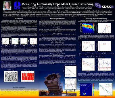
Here is my AAS poster on my recent research on Luminosity Dependent Quasar Clustering (click here for larger image):
Friday, January 6, 2012

Sunday, December 11, 2011
Teaching Statement
Some of my job applications required a statement of teaching and philosophy. I thought I'd post it here, as it took some time to write, and might be helpful to others writing similar statements.
Teaching Experience and Philosophy
Jessica Kirkpatrick
Jessica Kirkpatrick
My passion for physics and my personal academic history have combined to fuel a mission in me: I want to create a classroom environment which makes physics a more accessible subject. When diagnosed with a learning disability at age seventeen, I developed an interest in varied learning styles and strategies. Although I had always flourished in the sciences and mathematics, I would spend hours reading a single chapter of print. After extensive work with an educational therapist, I learned to draw on my strengths and accommodate my weaknesses using assistive technology as well as new approaches to learning.
While an undergraduate at Occidental College, I collaborated with another student to found the Learning Difference Association (LDA), which promoted awareness of learning disabilities and helped students with learning difficulties cope with their emotional, academic, and social concerns. LDA was a huge success: nearly half of the learning disabled students at Occidental were members, and it received the Club and Organization of the Year Award in 2000.
Founding LDA intensified my interest in understanding how people learn effectively. Hearing stories from my LDA peers about how their learning differences created challenges for them inside and outside of the classroom, I started to get a more complete perspective on how difficult learning can be for some students. While mathematics and physics came more naturally to me, I watched many classmates struggle with this material. I realized that some of the strategies LDA students used to accommodate their learning differences might be applicable to help the average physics student as well.
I next developed a physics version of the Academic Mastery Program (AMP), a tutorial program already utilized in other disciplines at Occidental. AMP provided a supplementary workshop to introductory classes, in which upperclassmen facilitated discussion, led problem-solving sessions, and conducted experiments with beginning students. I implemented this program as a sophomore, designed its lesson plans and problem worksheets, served as a facilitator for three semesters, and obtained funding to ensure its continuation.
My objective when developing AMP’s curriculum was to build on a student’s intuitions about the physical world from her day-to-day experiences. I hoped to guide her through a series of questions or exercises – creating a bridge between her observations of the world and the (sometimes unintuitive) problems that appear on typical physics exams and homework sets. Students developed this knowledge not only through pen-and-paper problem solving, but also by performing experiments, creating models using computer programs, and engaging in discussions with peers. My intention was to present the material in a variety of ways, making physics more accessible to a greater number of students.
I continued peer tutoring and advising throughout my undergraduate career. My personal history allowed me to empathize with struggling students and my alternative learning skills proved useful for many. I gained repute among Occidental physics and math undergrads, and my tutoring and advising hours always began with students lined up waiting for my arrival. My talents were acknowledged by the physics faculty who offered me a position as an adjunct instructor.
The year after I graduated from Occidental, I stayed on to work as an adjunct laboratory instructor and post-graduate researcher. The opportunity to be in charge of a classroom of 15 students helped me gain additional perspective on the role of college professor. I started to appreciate the interpersonal dynamics involved in managing a classroom, balancing the needs of the strongest or most vocal with those of students too shy to ask their questions. I did this by not only creating class-wide discussions, but having people talk in pairs or small groups. I made a point of engaging each individual student to evaluate if he was understanding the material. When a student didn’t understand, I would encourage him to talk with a peer who did. This allowed me to move on to other students, while providing the peer an opportunity to explain the concept and solidify her understanding as well. I also encouraged students to work with different people each week so that by halfway through the semester, most students knew each other, felt more comfortable engaging in class-wide discussions, and experienced a more jovial learning environment.
Every teaching session left me invigorated and extremely grateful for the opportunity to help others – especially considering all the assistance I was given when I was struggling. I decided that I wanted to become a science educator. This along with my love of physics research inspired me to pursue a PhD at UC Berkeley.
At UC Berkeley I have been a graduate student instructor (GSI) for three semesters. During this time I taught the entire physics introductory series. The structure of the introductory courses at UC Berkeley involves 2.5 hours per week of lecture with a faculty member, and 5 hours per week of labs, problem solving sessions, and office hours with a GSI. Because the majority of the students’ time per week is spent with the GSI, effective GSI instruction is critical to the student’s success.
During this time, I started to get an even broader sense of the struggles students have with introductory physics material. A major issue for students at UC Berkeley – a public university which attracts students from a wide variety of backgrounds – is inadequate mathematics and science preparation for these courses. I repeatedly saw students who had understanding of the physical concepts and enjoyment of the material, but performed poorly on homework and exams because of weak math, language, or laboratory skills. I tried to identify these students early in the semester, by giving a skills assessment in the first week of class. This worksheet had students describe their background in math and physics and tested various skills that were considered a prerequisite for the class. I would then meet with students individually to discuss their assessment, and make recommendations as to how they might improve in certain areas. This sometimes involved their attending a workshop which reviewed certain math skills or taught a specific computer program. I might even recommend that the most under-prepared student postpone taking physics until he had taken a refresher course in math.
It became clear to me that a student’s success, motivation, perseverance, and determination is highly influenced by her psychological beliefs about herself and her epistemological beliefs about physics. I observed smart, capable students belittle themselves and give up (even when they were on the right track) because they thought “I just can’t do physics.” I saw students ignore their physical intuitions, and answer questions using rote memorization because they thought “that’s just how you do science.” I found it important to be especially encouraging of students who lacked confidence, to be very open about my own academic struggles, and to provide a realistic perspective on the amount of time and energy required to understand something as challenging as physics. I tried to develop in my students a general set of problem solving skills by giving unique problems which weren’t easily solved using “plug and chug” algorithms, but encouraged creativity and deeper thought. My goal was for my students to view physics as a web of intuitive concepts instead of a disconnected list of facts and formulas.
I see my teaching philosophy as a work-in-progress. I believe a key component to being an effective teacher is to avoid complacency by continually making adjustments as I gain more experience and obtain feedback from student and peers. My hope, if given a teaching position at your institution, is to gain a more formal experience in teaching and science education. I am also interested in developing educational projects, assignments, and exercises using astronomical data from the Sloan Digital Sky Survey, which would tie together my research interests with the teaching component of this position.
While an undergraduate at Occidental College, I collaborated with another student to found the Learning Difference Association (LDA), which promoted awareness of learning disabilities and helped students with learning difficulties cope with their emotional, academic, and social concerns. LDA was a huge success: nearly half of the learning disabled students at Occidental were members, and it received the Club and Organization of the Year Award in 2000.
Founding LDA intensified my interest in understanding how people learn effectively. Hearing stories from my LDA peers about how their learning differences created challenges for them inside and outside of the classroom, I started to get a more complete perspective on how difficult learning can be for some students. While mathematics and physics came more naturally to me, I watched many classmates struggle with this material. I realized that some of the strategies LDA students used to accommodate their learning differences might be applicable to help the average physics student as well.
I next developed a physics version of the Academic Mastery Program (AMP), a tutorial program already utilized in other disciplines at Occidental. AMP provided a supplementary workshop to introductory classes, in which upperclassmen facilitated discussion, led problem-solving sessions, and conducted experiments with beginning students. I implemented this program as a sophomore, designed its lesson plans and problem worksheets, served as a facilitator for three semesters, and obtained funding to ensure its continuation.
My objective when developing AMP’s curriculum was to build on a student’s intuitions about the physical world from her day-to-day experiences. I hoped to guide her through a series of questions or exercises – creating a bridge between her observations of the world and the (sometimes unintuitive) problems that appear on typical physics exams and homework sets. Students developed this knowledge not only through pen-and-paper problem solving, but also by performing experiments, creating models using computer programs, and engaging in discussions with peers. My intention was to present the material in a variety of ways, making physics more accessible to a greater number of students.
I continued peer tutoring and advising throughout my undergraduate career. My personal history allowed me to empathize with struggling students and my alternative learning skills proved useful for many. I gained repute among Occidental physics and math undergrads, and my tutoring and advising hours always began with students lined up waiting for my arrival. My talents were acknowledged by the physics faculty who offered me a position as an adjunct instructor.
The year after I graduated from Occidental, I stayed on to work as an adjunct laboratory instructor and post-graduate researcher. The opportunity to be in charge of a classroom of 15 students helped me gain additional perspective on the role of college professor. I started to appreciate the interpersonal dynamics involved in managing a classroom, balancing the needs of the strongest or most vocal with those of students too shy to ask their questions. I did this by not only creating class-wide discussions, but having people talk in pairs or small groups. I made a point of engaging each individual student to evaluate if he was understanding the material. When a student didn’t understand, I would encourage him to talk with a peer who did. This allowed me to move on to other students, while providing the peer an opportunity to explain the concept and solidify her understanding as well. I also encouraged students to work with different people each week so that by halfway through the semester, most students knew each other, felt more comfortable engaging in class-wide discussions, and experienced a more jovial learning environment.
Every teaching session left me invigorated and extremely grateful for the opportunity to help others – especially considering all the assistance I was given when I was struggling. I decided that I wanted to become a science educator. This along with my love of physics research inspired me to pursue a PhD at UC Berkeley.
At UC Berkeley I have been a graduate student instructor (GSI) for three semesters. During this time I taught the entire physics introductory series. The structure of the introductory courses at UC Berkeley involves 2.5 hours per week of lecture with a faculty member, and 5 hours per week of labs, problem solving sessions, and office hours with a GSI. Because the majority of the students’ time per week is spent with the GSI, effective GSI instruction is critical to the student’s success.
During this time, I started to get an even broader sense of the struggles students have with introductory physics material. A major issue for students at UC Berkeley – a public university which attracts students from a wide variety of backgrounds – is inadequate mathematics and science preparation for these courses. I repeatedly saw students who had understanding of the physical concepts and enjoyment of the material, but performed poorly on homework and exams because of weak math, language, or laboratory skills. I tried to identify these students early in the semester, by giving a skills assessment in the first week of class. This worksheet had students describe their background in math and physics and tested various skills that were considered a prerequisite for the class. I would then meet with students individually to discuss their assessment, and make recommendations as to how they might improve in certain areas. This sometimes involved their attending a workshop which reviewed certain math skills or taught a specific computer program. I might even recommend that the most under-prepared student postpone taking physics until he had taken a refresher course in math.
It became clear to me that a student’s success, motivation, perseverance, and determination is highly influenced by her psychological beliefs about herself and her epistemological beliefs about physics. I observed smart, capable students belittle themselves and give up (even when they were on the right track) because they thought “I just can’t do physics.” I saw students ignore their physical intuitions, and answer questions using rote memorization because they thought “that’s just how you do science.” I found it important to be especially encouraging of students who lacked confidence, to be very open about my own academic struggles, and to provide a realistic perspective on the amount of time and energy required to understand something as challenging as physics. I tried to develop in my students a general set of problem solving skills by giving unique problems which weren’t easily solved using “plug and chug” algorithms, but encouraged creativity and deeper thought. My goal was for my students to view physics as a web of intuitive concepts instead of a disconnected list of facts and formulas.
I see my teaching philosophy as a work-in-progress. I believe a key component to being an effective teacher is to avoid complacency by continually making adjustments as I gain more experience and obtain feedback from student and peers. My hope, if given a teaching position at your institution, is to gain a more formal experience in teaching and science education. I am also interested in developing educational projects, assignments, and exercises using astronomical data from the Sloan Digital Sky Survey, which would tie together my research interests with the teaching component of this position.
Friday, December 9, 2011
Chat with Nikhil
I talked to Nikhil last night about the post-doc / job search. He said some interesting things that I thought I should write here.
I ended up applying to 15 postdocs and 8 faculty positions. My work is done, now I just have to hope that someone wants me.
- Letters are the most important thing. Good letters are more important than a good CV or research statement.
- A good research statement is a statement that is tailored to the university you are applying to. Show that you have some interest in / idea about the work going on there.
- Professionally it isn't great to stay at the same place, but people understand if there are extenuating circumstances (two body problem etc).
- Get as many people as possible to look over your applications, especially those that have been on hiring committees.
- Get on a hiring committee / grant review committee. That's how you learn what people are looking for.
I ended up applying to 15 postdocs and 8 faculty positions. My work is done, now I just have to hope that someone wants me.
Friday, December 2, 2011
Practice Job Talk
Today I did a practice job/qual talk with my group a few extra post-docs at LBNL. Below are some feedback/notes. I also have emailed notes from Beth, David and Genevieve.
Likelihood:
*Show some plots of the 5D parameter space which shows the redshift evolution of quasars in that space and compares them to stars. Apparently there is something like this in Ross 2011.
*Also note the increase in errors with increased redshift.
*This will allow you to easily answer questions about why targeting is hard in this redshift range.
*redshift distribution plot -- what causes those bumps.
*More motivation -- show right away that 1/2 as many quasars would be targeted if we hadn't done this.
*Be able to answer questions about the quasars that we missed. Are they biased? Talk to McGreer about his models...
*Why did we go from 2 -> 3 arc seconds from sdss 2 to boss
be able to explain EVERYTHING you put on a slide.
*BOSS did do imaging (not just spectroscopic)
*Introduce terms better
*More set-up
Clustering:
*Need to connect more to models and interpretations
*Outline plan moving forward with modeling.
More:
*Need a timeline to finish
*Need to talk about third (mini) project to finish off PhD
General:
*MW likes to ask about dark matter.
*SP likes to ask about what is the main contribution to your errors.
*Should be able to be able to derive the likelihood equations, write down baye's theorem, understand what it means.
*Read Eisenstein 2007 about BAO understand more about where that comes from
*Be able to write down the equation of state. Derive dark energy stuff.
*Know more about what goes into the different luminosity functions.
*Need to be aware of shaky voice
*Dress comfortable
*Upturn in tone, like asking a question.
Friday, November 4, 2011
Talk at Princeton
I'm at the BOSS QSO Working group meeting at Princeton today. I'm giving a talk. I am still not sure if I can publicly release some of these results/data, but here is the money-slide. It shows that I am getting a clear separation between the clustering signal of the bright quasars (x-axis) and the dim quasars (y-axis) (~3-sigma):

For readers in the SDSS collaboration the full talk and more information is here on the SDSS wiki.
Thursday, November 3, 2011
Talk at Brookhaven
Yesterday I gave the first research seminar of my life. It was a 50 minute talk at Brookhaven National Labs. Overall, I think it went well. The talk was to a small group of research scientists. About half were cosmologists, the other half were physicists of another flavor.
My hosts Erin Sheldon and Anže Slosar gave me some really helpful feed back:
My hosts Erin Sheldon and Anže Slosar gave me some really helpful feed back:
- I wasn't expecting such a mixed audience, and I didn't give enough introduction to BOSS, and the data. For instance I didn't directly discuss why quasars are hard to target. I also didn't emphasize that the inputs to the likelihood were the photometric fluxes. I should have talked more about the difference between photometric and spectroscopic data. But in general, I need to be more aware of the audience and beef up the introduction.
- I went through the full derivation of the likelihood, and this wasn't necessary.
- I was nervous and relied on notecards. Anže said this made it look like I didn't understand what I was talking about. Basically, I need to practice the talk a bunch so I don't need cards.
- I mispoke and talked about the first BAO detection. I said it was from SDSS-II, it was actually from SDSS-I.
- In general I didn't feel prepared to answer all questions, I need to go through the talk and make sure I fully understand everything I am posting -- for instance how was the first BAO detection made?
The talk was more fun than I expected, and has definitely eased my nerves in terms of my quals. I think I can use a similar version of this talk for my quals, which is good.
Friday, October 14, 2011
CosmoloPy
Why didn't I know this package existed before?
http://roban.github.com/CosmoloPy/
Functions Include:
- Various cosmological densities.
- Various cosmological distance measures.
- Galaxy luminosity functions (Schechter functions).
- Conversion in and out of the AB magnitude system.
- Pre-defined sets of cosmological parameters (e.g. from WMAP).
- Perturbation theory and the power spectrum.
- The reionization of the IGM.
Very cool!

Thursday, October 13, 2011
More python plotting tricks
I absolutely love these python plotting page with examples:
http://matplotlib.sourceforge.net/gallery.html
http://www.scipy.org/Cookbook/Matplotlib
Today I figured out how to change the fonts of the legend on my plot, and add a shadow. (Pretty exciting I know.) I've also made the lines a little bit thicker, and different styles (so that it looks pretty in black and white printing of the paper).
from matplotlib.font_manager import fontManager, FontProperties
font= FontProperties(size=24);
fig = plt.figure()
ax = fig.add_subplot(111)
ax.plot(chi, probsqso, 'k-', label = '$\mathrm{QSOs}$', linewidth=2.0)
ax.plot(chi, probsqsow, 'k:', label = '$\mathrm{QSOs\\ Weighted}$', linewidth=2.0)
ax.plot(chi, prob, 'k--', label = '$\mathrm{Gals}$', linewidth=2.0)
ax.set_xlabel("$\\chi$", fontsize=24)
ax.set_ylabel("$\mathrm{Normalized\ }dN/d\\chi$",fontsize=24)
pylab.legend(loc=2,shadow=True,prop=FontProperties(size=18))

Friday, September 23, 2011
Blogging Update
I've been a very bad blogger recently. Basically this is because I've been spending all my time working on a project with people at Berkeley, and so there isn't as much need to post, as I was mainly using this blog to communicate to Alexia on our project. Alexia, if you are reading this I haven't given up on our project, and in fact much of the work I am doing now will be useful for us. However, considering I want to graduate this year, I've been pushing forward on this new project that is working, and close to being publishable.
My collaborators at Berkeley have wanted me to keep quiet about my new project's results (until we publish), and so I've not been able to post plots etc. for this project. However, I do find it helpful for organization and motivation to write on this blog, so I think I'll start writing on it again, if nothing else that to say what I did that day.
I've been working a lot of error analysis for my correlation functions. I have bootstrap/jackknife analysis in place and have been doing various fits to the correlation function to try to figure out the errors. It's strange because depending on what fitting methods I use, I get wildly different errors... and sometimes it seems like I am getting a statistically significant result (3+ sigma) and other times not.
I've also been much better at writing self-contained code that is easily re-runnable. I used to drive Alexia crazy will all the "cutting and pasting" I was doing. Well no more. I know am doing object-oriented programs with lots of functions etc. It's actually really nice.
I've been learning a lot more about python. Using cool fitting tools and statistics tools. Python is such a powerful language.
Thursday, September 22, 2011
On the Market
Hello readers!
I'm officially on the job market this year. Aiming to graduate in June, and hoping to start working the following fall. If you like what you've been reading, please consider hiring me.
Due to a "two-body" problem, I am mainly looking at jobs on the west coast of North America (Los Angeles, San Francisco, Seattle, Vancouver) and New York City.
Please visit my web site for more information.
Thursday, September 15, 2011
I hate IDL
I've been working a little bit in IDL for this new project because all the data is in fits files, Alexie has a lot of code that is in IDL which we are using to handle the CFHT data.
thisfile = './qsosMergedInfo.dat'
writecol,thisfile, qsos.ra, qsos.dec, qsos.z, qsos.zwarning, $
qsos.flux_clip_mean[0],qsos.flux_clip_mean[1], qsos.flux_clip_mean[2], $
qsos.flux_clip_mean[3], qsos.flux_clip_mean[4], fmt='(f,f,f,f,f,f,f,f,f)'
Anyway, I spent all morning struggling trying to do very simple input and output from this stupid stupid language.
I learned a few things, and since I hardly ever code in IDL, I am sure I'll forget unless I write them down right now. So here we go:
1) Tag names
You can get the tag names from a structure like this:
tname = tag_names(struct)
2) Merging structures
You can merge two structures as follows:
str3 = create_struct(str1,str2,NAME='str3')
3) writecol bug
For some reason when I try to use writecol to write out data, if there are more that 6 columns, and I don't specify the format, it puts a return carriage in the middle of the data. This goes away if you specify the format:
thisfile = './qsosMergedInfo.dat'
writecol,thisfile, qsos.ra, qsos.dec, qsos.z, qsos.zwarning, $
qsos.flux_clip_mean[0],qsos.flux_clip_mean[1], qsos.flux_clip_mean[2], $
qsos.flux_clip_mean[3], qsos.flux_clip_mean[4], fmt='(f,f,f,f,f,f,f,f,f)'
Wednesday, September 7, 2011
More streamlining
Martin White keeps telling me I should streamline my code/runs so that it is really easy to re-run with new data/subsets.
I've been working on doing that for running the correlation functions, and running the error analysis. I've written code:
../Jessica/qsobias/Correlate/runCrossCorrelationJackknifeMulti.py
That takes the run directories, and qso-file names as inputs (along with other constants for the correlation) and runs the correlation on all those different files at once.
Then there is code that compares the correlation functions and makes a bunch of pretty plots. I'm running it for the first time now. Hope it all works!
Oh, and I need to talk to Martin White about what to do when certain realizations of the bootstrap/jackknife are negative. This causes problems with fitting the power-law, and also isn't physical. Currently I re-run the realization if it has a negative value for the correlation function, but I don't think this the right thing to do, as it is biasing the bootstrap to have higher clustering values.
Subscribe to:
Posts (Atom)